We’ve made a couple of small changes in our meeting spaces, emails and on our website. The changes are so subtle that most people won’t even register, but the people who will pick up on the changes will notice and will hopefully know that TGM is a safe and welcoming organisation to work for and work with.
We are a welcoming, empathetic bunch at TGM and we’d also like to think we’re progressive but realised we could do more to show that to visitors and prospective team members. It is important to us that ALL people feel welcome and comfortable visiting, working and associating with TGM.
Rainbow communities
We embarked on some professional development to learn more about rainbow communities. We consulted friends in the community, our kids and reached out to our local rainbow colleagues and we learnt that when it comes to interacting with people from rainbow communities it is good to show it. The old adage a picture paints a thousand words is true in this case.
What we’ve done
Like with all new things, we’ve started at the beginning and still have our trainer wheels on. We’ve made a couple of physical changes to ‘signal’ our growing understanding and openness to learning. For us, we’ve registered as a safe space alliance member that shows we’re a LGBTQIA+ friendly business and provided an option for people to tell us their pronouns on our enquiry form. In our building we’ve incorporated a progress pride flag. Some team members have their pronouns on their email footer too.
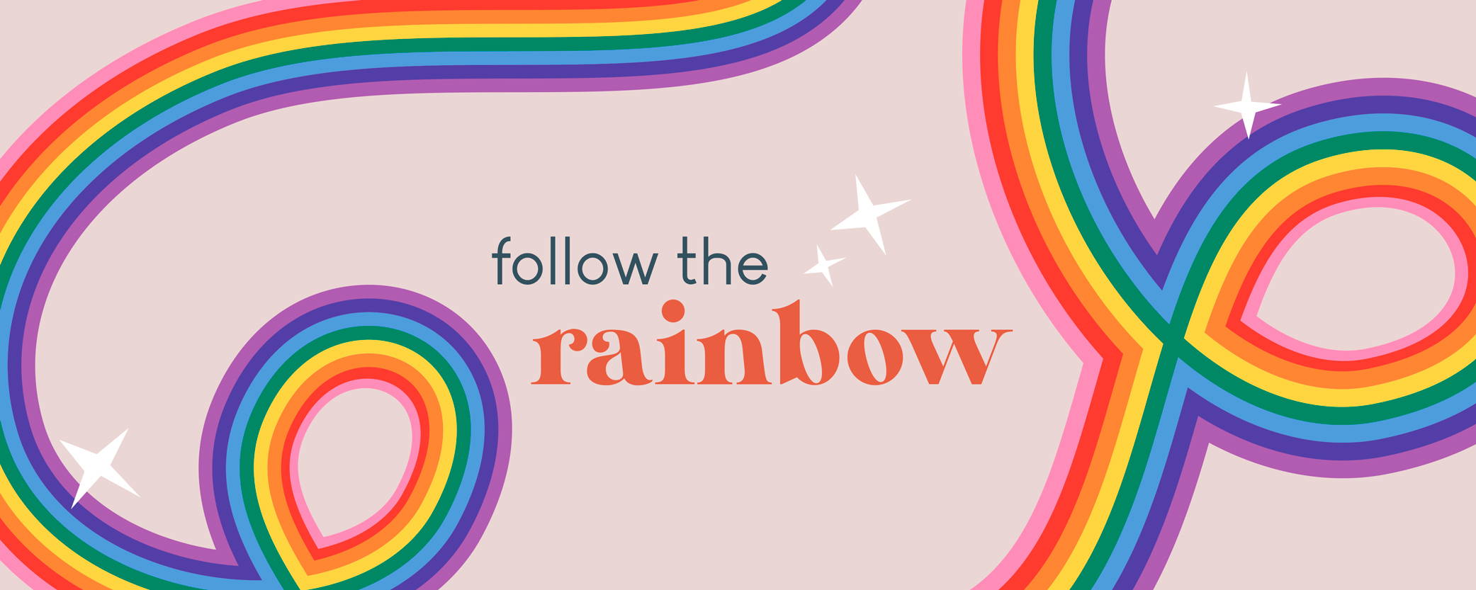
The Progress Pride Flag
Being designers, we enjoyed hearing the story behind the design of the Progress Pride Flag.
Gilbert Baker, who designed the original rainbow flag for the 1978 San Francisco’s Gay Freedom Celebration, choose pink to stand for sexuality, red for life, orange for healing, yellow for the sun, green for nature, turquoise for art, indigo for harmony and violet for the soul.
The flag evolved and other flags have been created. Today the Progress Pride Flag, designed by Daniel Quasar, features white, pink light blue, brown and black chevron stripes as well as the traditional rainbow stripes to place a greater emphasis on inclusion and progression.
For Quasar, the light blue, pink and white stripes represent trans and non-binary individuals and the brown and black ones represent marginalised People of Colour (POC) communities. The black stripe has a dual meaning for those living with AIDS and the stigma and prejudice surrounding them, as well as those who have been lost to the disease.
What is Rainbow?
Rainbow is a broad umbrella term that encompasses a range of sexual orientations, gender identities and expressions and sex characteristics, and is less of a mouthful than LGBTQIA+ (lesbian, gay, bisexual, transgender, queer or questioning, intersex, ace identities and more) or SOGIESC (sexual orientation, gender identity and expression, and sex characteristics). It is the term we’ve chosen to use to refer to rainbow communities and our mahi to grow our knowledge and take action in this space.
But isn’t it just virtue signalling?
Our advice included discussion on virtue signalling (aligning with a cause, event or movement to reflect positively on you or your business) and concluded that signalling our willingness to learn and find out more was a positive signal to send and done well, welcomed.
Interested?
We’d suggest you find some professional development talks and readings to grow your understanding and reach out to the rainbow communities. Anything that helps your customers/clients/patients feel more comfortable working with you and opens a wider pool of candidates when it comes to recruitment has got to be a good thing doesn’t it?