
brand

design

marketing
discovered you through


design
— Logos
— Branding
— Illustration
— Development
— Branding
— Illustration
— Development
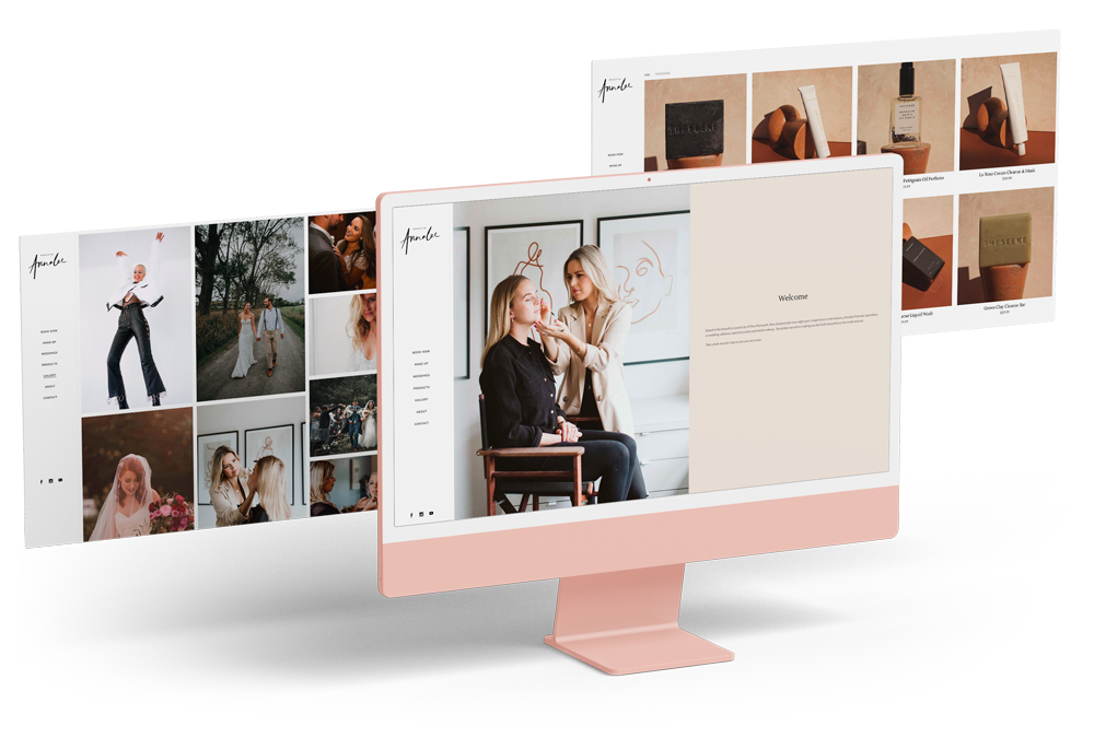
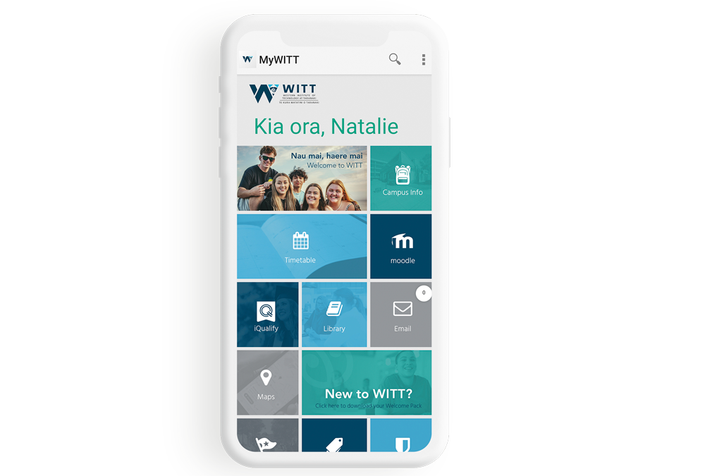
website
brand
— Strategy
— Design refresh
— Brand creation
— Campaign management
— Design refresh
— Brand creation
— Campaign management
marketing
— Marketing strategy
— Online development
— Digital marketing
— Content creation
— Copywriting
— Social media
— Email marketing
— Online development
— Digital marketing
— Content creation
— Copywriting
— Social media
— Email marketing
— Corporate profiles
— Rack cards
— Business cards
— Promo products
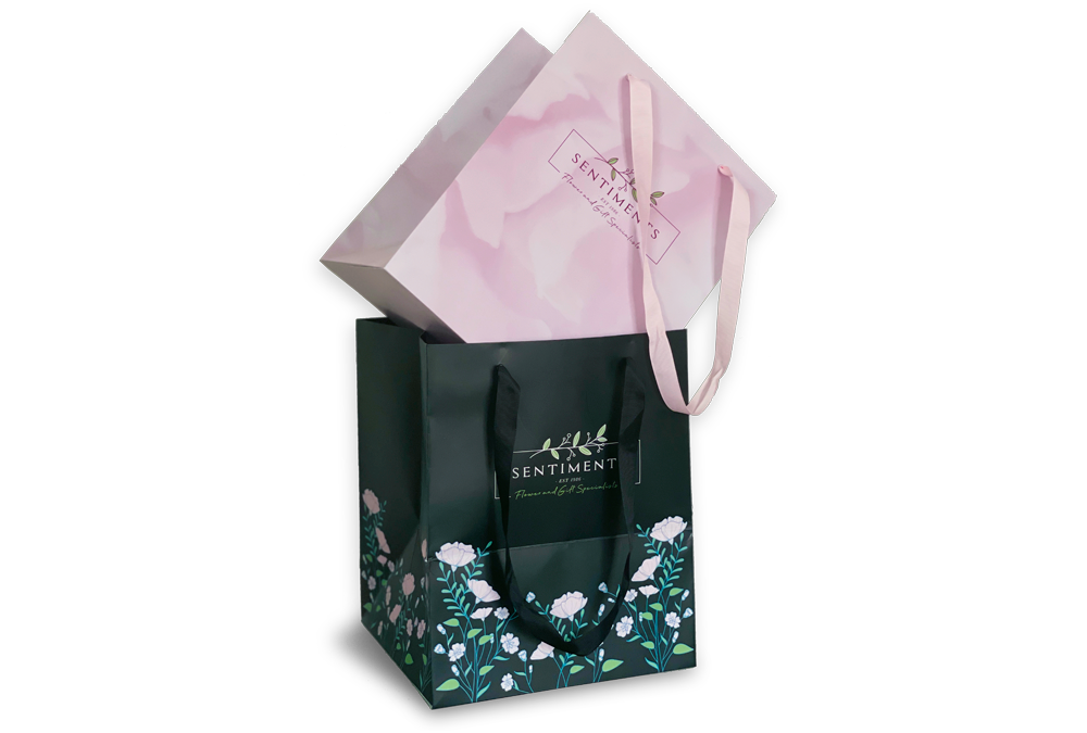
— Packaging
— Flags and banners
— Expo walls
— Rack cards
— Business cards
— Promo products
— Packaging
— Flags and banners
— Expo walls
signage
— Digital billboards
— Vehicle
— Billboards
— Building signage
— Directional signage
— Interior signage
— Vehicle
— Billboards
— Building signage
— Directional signage
— Interior signage
kia ora, take a look and
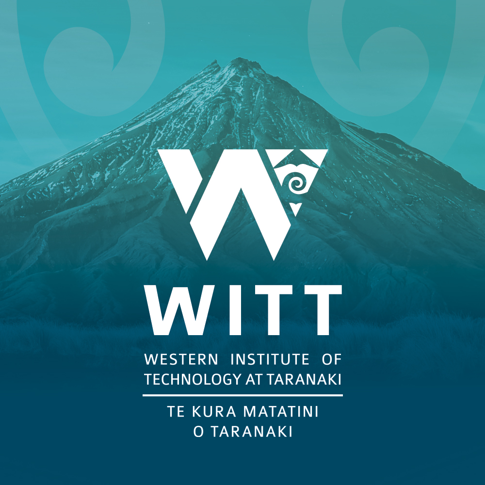
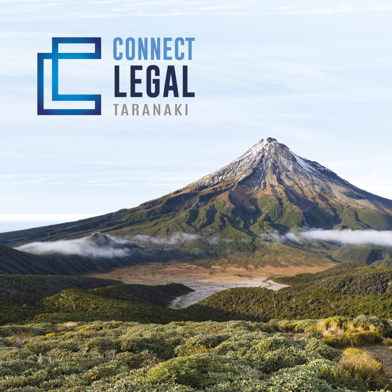
Grow your business with thoughtful design and targeted marketing solutions. See some of our latest client campaigns and projects. We’d love to see your brand here too, come and say hello.


go on, view more of our mahi →
get in touch
whakapā mai
Join us for a free one-hour, no-strings-attached consultation where we sit down over a coffee and talk about your organisation, your challenges and your goals. Whether you’ve got a plan or need some ideas, we’re keen to help. Kōrero mai.


 grab some signage deals!
 download our website checklist